Street Art Matters

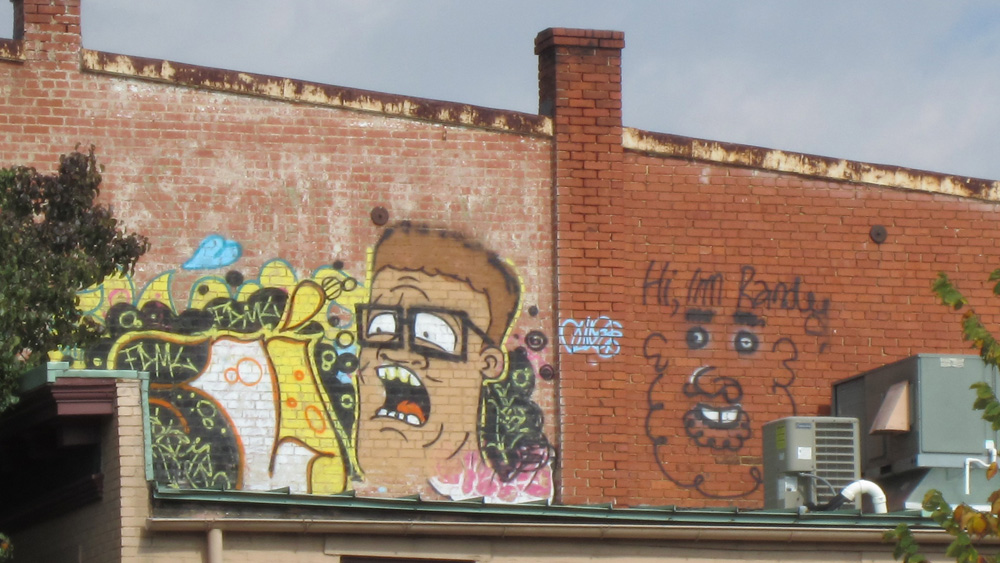
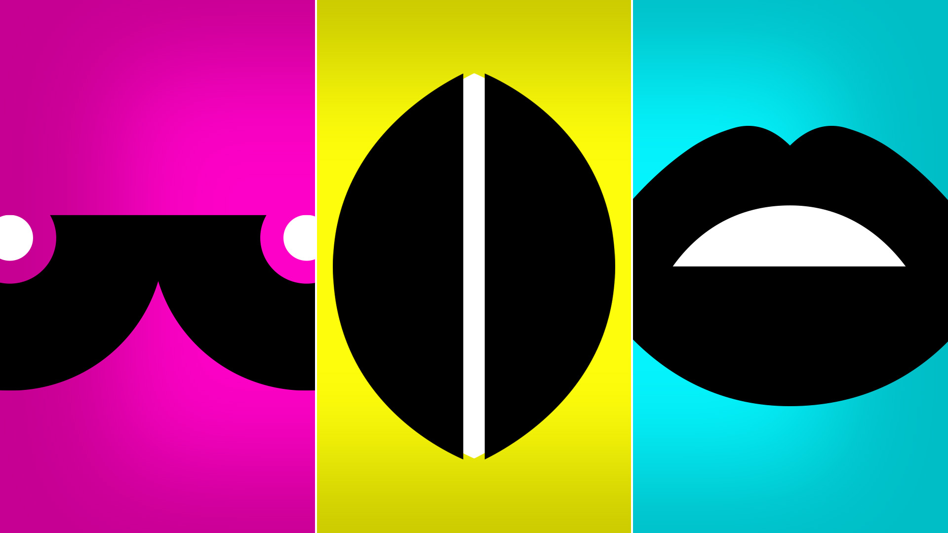
I recently spotted the street art you see above in the quaint city-town I call home. This struck me as "awesome!" and I will tell you why...

  • I live in a small town community where street art is typically confined to “Fuck You Asshole” painted on a sign or band stickers slapped on transformer box.
  • The “thriving arts community” of my town consists mostly of people, over the age of 60, painting landscapes and cute pets.
  • This will surely spark outrage and condemnation about angst-ridden youth and how we need more rules and police to clean things up.

The piece took time to create, was bold in it's visibility and was the first of a kind in this town. It excited me. It made me reflect on how far street art has come (think Banksy, Invader, Plastic Jesus) and how far traditional art has yet to go.

As a new artist, I am beginning to build relationships and make connections with art communities and “established” artists. I find that the art world can be both very welcoming and also incredibly alienating. I have come across many artists who look down their noses at those of us who did not go to the top art schools, who engage in non-traditional forms of art and who are looking to make a statement with the goal of making a change to some aspect of our society. These revelations are both troubling and invigorating. Troubling, because the years of working hard in 9-5 jobs to pay bills and survive so that I could realize my dream of being artist are marginalized. Invigorating, because the narrow-minded attitude that these “artists” have is the very reason I have chosen to define myself as a conceptual artist.

So back to my point. Street art matters because, in my opinion, it is the purest form of art expression. Despite the threat of criminal charges and no financial gain, this person has created art that others will see. That is the artist I want to be. And that is why street art matters to me.

Staining with Tea

To begin work on the #Selfie project, I needed a medium to recreate the imagery from the digital photos. I've always enjoyed working with charcoal and pastel...the dirtiness of the drawing process and the individual mark of the artist's hand seemed appropriate to translate the stark, pixelated photos into works of "fine" art.

A couple of old canvases lying around the studio caught my eye. They were the perfect size and shape - extremely vertical and conducive to building a series of drawings. Additionally, the sheer cropped shape would make for an interesting perspective of the subject. I wanted the canvas background to feel old, used and aged, complimenting the smudges and strokes of the #Selfie drawings. Watercolor could work, but I revel much more in the use of unconventional techniques that produce unexpected (or expected) results. The thought of how tea stains teeth, mugs and saucers over time was interesting. Layered stains, red-brown, warm and fluid were just the perfect backdrop and technique for aging my blank canvases.

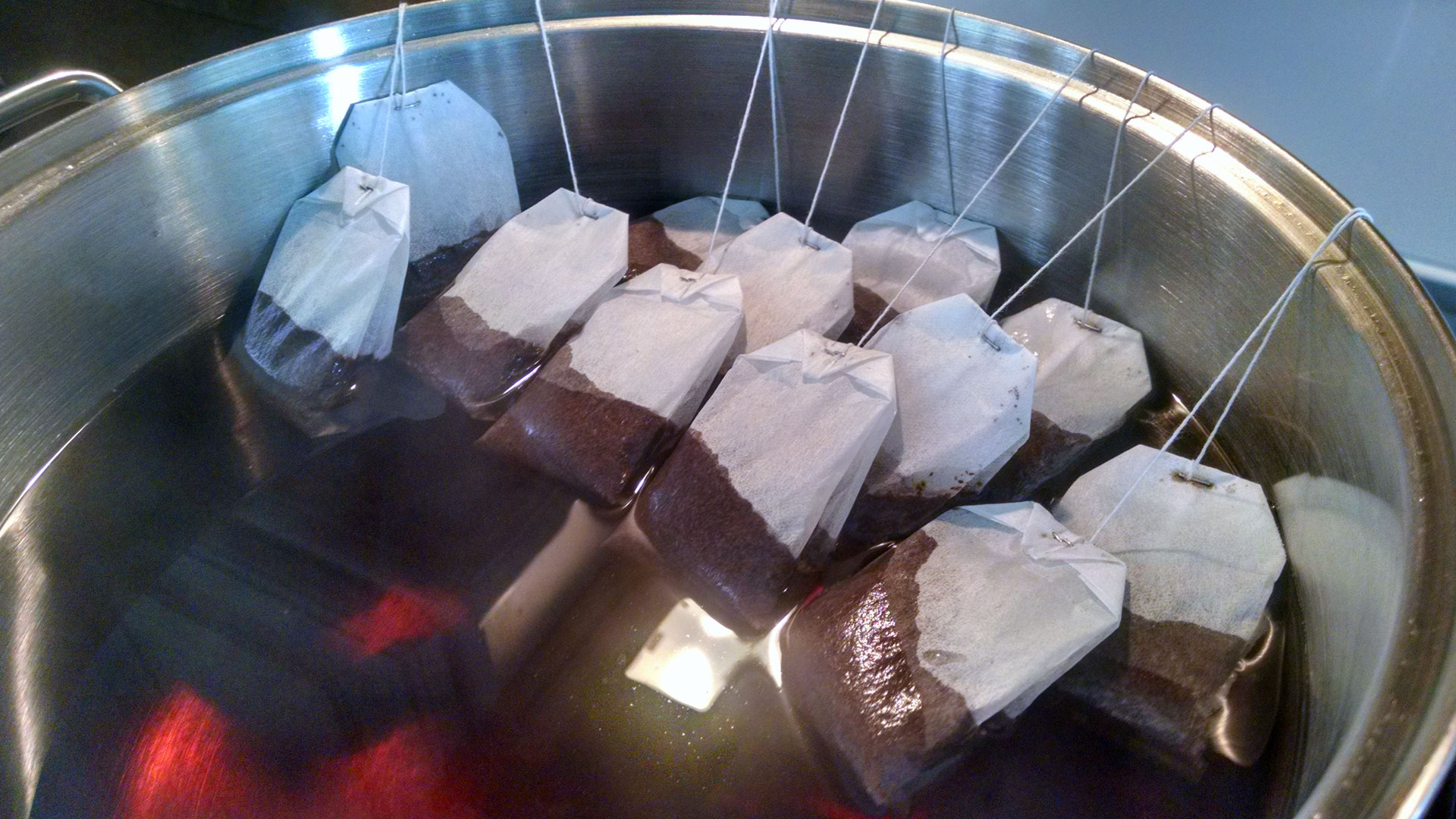
Plain old Lipton black tea is cheap and easy, and on hand. After a few experiments with brew intensity, I learned you couldn't go wrong with deep, dark, over-brewed tea. 

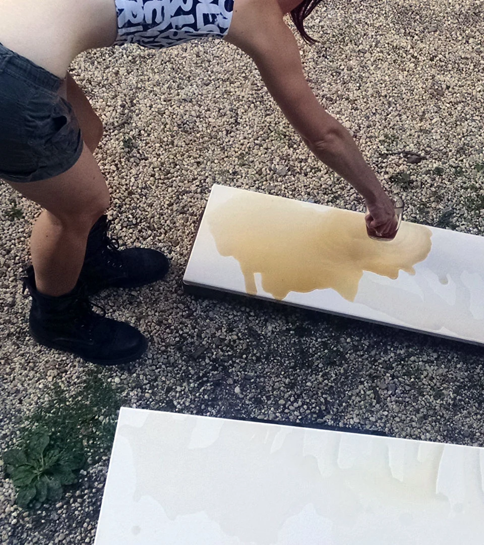
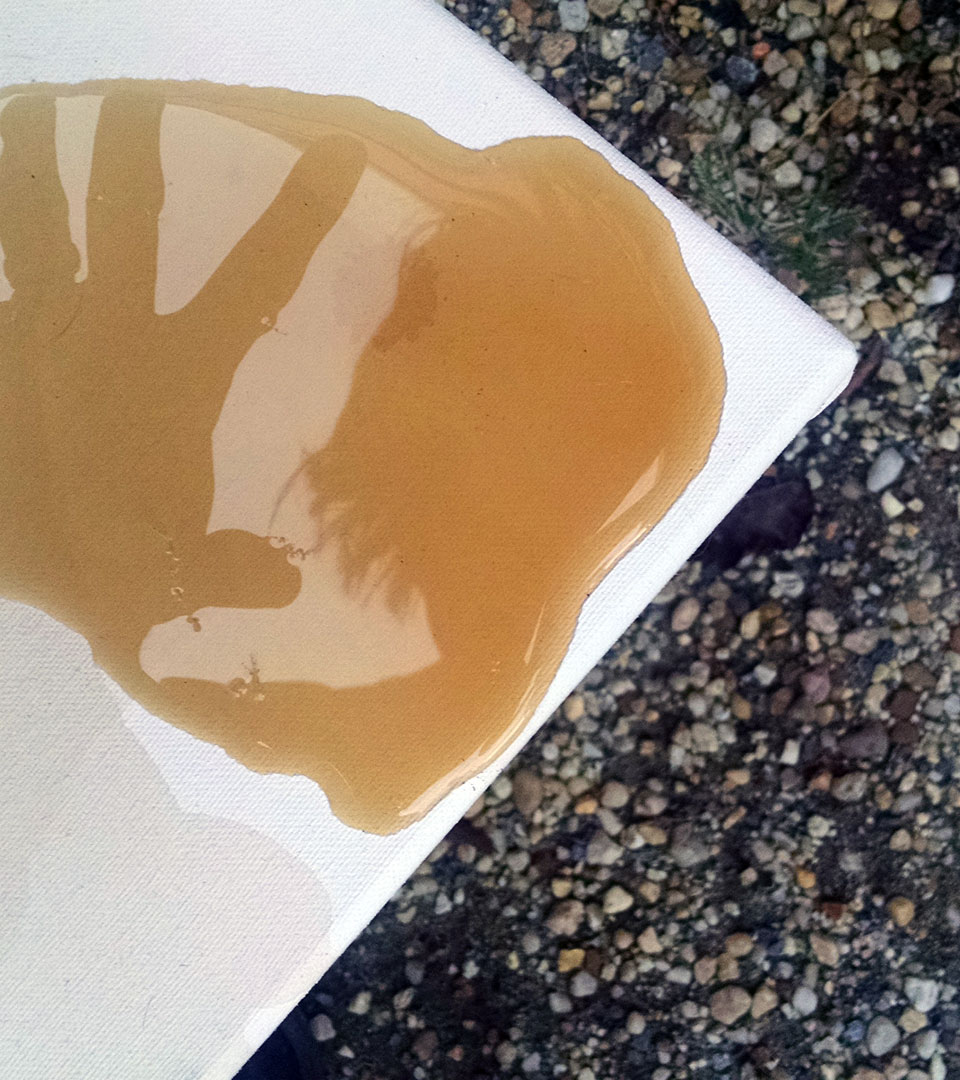
A few passes at pouring, tilting and guiding the liquid as it flowed over the canvas produced unique effects for each. After each pour, allowing the tea to dry on the fabric between staining also allowed for layering the stain shapes and intensifying the color. The most surprising result was the originality of each tea design...the flow and the contours of the stains mimicked the curves of the spine or the roundness of the stomach.

Tea has been a tradition in my family since I was very young. My aunt introduced me to tea and home-grown honey in steaming mugs. I came to look forward to the chill of Autumn in order to snuggle up, sip and take a moment to myself enjoying my tea. It seems the use of tea has come full circle, travelling from my childhood to adult life in very unexpected and artful way. Tea is comfort. Tea is warm. Tea is savory and sometimes sweet. Tea stains and leaves behind a mark of those moments, layered over time.

Designing Icons

I've been inspired lately by street art. It pops up in the most unexpected places and its impact is insistent and passionate. Bright colors, political messages, masterful illustrations, and random clusters of stickers, all beckon for your attention to seen and remembered. 

When I first began developing the idea of The Femme Project, three words popped into my head: kiss pop fuck. Each of the words is representative of a messaging concept for distinct collections of The Femme Project art. The resonant words became a tagline, the tagline became a hashtag, and the hashtag begged to be seen and heard. The dusty marketing wheels started turning, and the idea of creating a visual, iconic representation was conceived.

Simplicity and consistency make me happy. I enjoy the challenge of plucking a concept out of the air and breaking it down into its simplest, essential parts and positioning it anew. I began by illustrating graphical images of women's anatomy: breasts, vagina and mouth. Each body part symbolizes the various aspects of Kiss, Pop, Fuck. The breasts are indicative of motherhood, femininity, and the softer aspects of being a woman. The vagina represents the sexual spirit and appetite of being a woman. And, the mouth speaks for itself - the right of women to speak up, stand up and voice our beliefs, opinions and injustices.

Next, was color. Pulling from my print design background, a simple but bold palette was needed...pure CMYK. In print and in web, I wanted the color to be intense, demanding, predictable and consistent. Cyan, magenta, yellow and black are the perfect mix.

The next phase awaits production. Taking a page from the street art playbook, I love the viral nature of stickers. Who knows where #kisspopfuck might pop up next? On your neighbor's bumper...on the transformer downtown...on the light pole across the street...I think the world is ready for a femme invasion.